Tuesday, December 7, 2010
Color and Light Experiments
Some new watercolors.
One of which features a new character from a new series I conceived.
The other is a random fairy/sparrow guardian I did just for the setting.
Sunday, November 7, 2010
J.C. Leyendecker Inspiration
So I went to see a J.C. Leyendecker exhibition recently and I decided that he is my new favorite American illustrator.
I love his bold strokes and how easily he conveys cloth folds and such. My favorite aspect of his paintings though is how he does hair. The locks of hair curl at angles which give his pieces a more dynamic look. How he renders facial expressions is another thing I admire him for.
Anyway, I decided to do some more practicing with my tablet and I think this is the best digital painting (of the face at least) I've done to date. The face is done after one of my characters and I thought it would be nice to have a modern twist to the image. The juxtaposition of the bold shirt and tie contrast with the more carefully rendered face. The hand-lettered type adds a rugged look and seems to disregard modern conventions of computerized precision. Keeping Leyendecker and his ads for Arrow Collars in mind, I made the image an ad for a fake clothes brand.
Perhaps if I were feeling really ambitious I would actually do the rest of him with as much detail as the face. Oddly enough though, I would feel more comfortable if I did it with oil paint. Oh well.
Labels:
ad,
adobe,
clothes,
digital painting,
J.C. Leyendecker,
photoshop,
tablet
Sunday, October 24, 2010
Another Inspiration Yet Again
Friday, October 22, 2010
Another Ono Inspiration
Monday, October 18, 2010
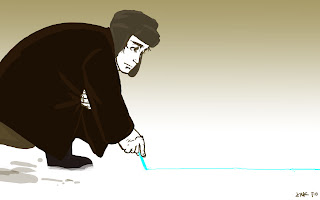
3 Long Pics
Thursday, October 7, 2010
Another Color Experiment
Found a new way to do color images on Photoshop.
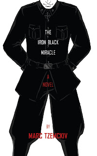
The first pic is actually the cover of a book that I made up. I don't plan on writing the book; but it's something one set of my characters read.
Basically the technique is fairy simple. Block in colors, define with highlights or shadows, and do simple line drawings for the face.
I'm happy with it.
Friday, October 1, 2010
Something from a While Ago
So I started this thing a while ago, hoping that I would finish before the summer ended (yeah right, look where we are now).
It's the most painterly thing I've done in Photoshop so far and I really like how it looks. The only thing is I've completely lost interest in finishing it. I'm sure that's happened to all of us, but I was really into painting it digitally.
Oh well.
Guess I'll keep the techniques and save it for a project I care more for.
Saturday, September 11, 2010
New Blog/Web Series
I have a new series that up and ready to be checked out.
Basically it's about life in the Townhouses of my university.
Ideally, it will be updated weekly.
Link:
Basically it's about life in the Townhouses of my university.
Ideally, it will be updated weekly.
Link:
Labels:
comics,
limited series,
pacific,
townhouses,
townies,
university
Wednesday, July 14, 2010
Monday, July 12, 2010
A New Character and Blog
Here's a new character, he's out-grown his orphanage home.
He's from a new series I came up with during the World Cup.
Speaking of the Cup, I have a new blog too concerning a pair of Adidas Sambas.
http://2014brazilorbust.blogspot.com/
Friday, July 9, 2010
Random Player of the Day Series Week 4 Final
Friday, July 2, 2010
Friday, June 25, 2010
To Break Away from Soccer for a While
Monday, June 21, 2010
Random Player of the Day Series
I've noticed I've had a good amount of off-time at work, enough to practice my drawing skills so I decided to challenge myself. Since the World Cup is going on, I thought it would be an excellent opportunity to do portraits. I came up with the idea to do one portrait everyday of a player who was on a team who had a match that day. I assigned numbers to the teams and used a random number generator to pick the team and then the player.
I'm also experimenting with a new way to color/shade. Red, blue, green, and black are used since those are the only ink colors available to me without having to stray into garish hi-lighter territory. The colors are also fitting since they can be found in the flag of South Africa.
Here are the first three drawings (the most recent on top).
Not striking resemblances but I want the series to be a bit stylized.
Unfortunately I didn't come up with the idea until a few days into the tournament so I couldn't start from day 1; but that's okay since I decided I won't do any portraits on the weekends, so there won't be an even number of drawings anyway.
All drawings are based on the profile photos on FIFA's official website.
Friday, June 4, 2010
A Finished Sketch
So one night I was experimenting with Photoshop and I found a way of drawing with the tablet that I really like. All the lines are finished and they will stay in this sketchy manner, though I might add color to the piece later. I feel that these "hairy" lines match very closely to how I draw with a ball point pen (which is my preferred medium). I think I'll keep this tablet technique for a long time.
These characters are from my series. Two of which have appeared in pasts posts.
Tuesday, June 1, 2010
Sunday, May 23, 2010
Sunday, May 16, 2010
Illustrator Drawing
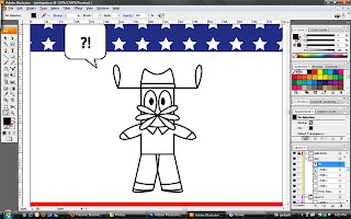
Lately I've been familiarizing myself with Adobe Illustrator, even going online to watch tutorials; and I must say, it requires a load of work. With the time I spent doing this one seemingly simple illustration, I could have completed an entire digital painting on Photoshop.
Although I don't get quick results on Illustrator, I do love the crispness of the lines and the even symmetry (something not as easily attainable on Photoshop, that's one of the beauties of a vector-based program).
Anyway, here's a screenshot of my drawing that was, for the most part, made of simple shapes.
I chose this particular character because he is basically made of simple shapes and I thought he'd be easier to create on Illustrator without a template to trace over.
Friday, May 14, 2010
The Four Winds
So recently I had to do a series for my final project in my watercolor class. I decided to do the four winds according to Greek mythology. For each one, the filigree border forms into a compass arrow pointing in the direction each wind blows. The borders are inspired by Alphonse Mucha.
The first one, Zephyrus. The West wind associated with spring.
The second one I did, Boreas. The North wind. Winter.
The third, Notus. South. Summer and Fall.
The last, Eurus. East. No particular season.
As he is the odd-wind-out I made him the last piece in the series and made it so that he is the only wind looking out at the viewer.
Friday, April 23, 2010
Thursday, April 15, 2010
Social Justice Art Show
Friday, April 9, 2010
Old Pastry Bag
Monday, March 15, 2010
Old Characters New Media
Saturday, March 13, 2010
Wednesday, February 24, 2010
Wednesday, February 17, 2010
Napkins: for more than just wiping your mouth
So recently I've begun a new past-time. I often find myself sitting at the college cafeteria waiting for my friends to show up for meals and that has led me to look for things to occupy my time with. First I brought my DS to play Pokemon but I realized it made me sleepy. I then decided to see if I could use the time to talk to my folks but naturally a daily phone conversation will not go on for half an hour. Usually I show up for meals without my backpack, so I don't have any homework to do or paper to doodle on.
Then one day, I noticed a guy sitting at another table across from me. He had very interesting eyes and I wanted to capture them. Fortunately I had a pencil in my pocket and a basket of napkins in front of me. This was the result.
About a month before I was talking to my friend at dinner and he was explaining that when his friend tried to grow out a mustache the hair grew out very wispy. I then imagined the thin mustache to move like creeping tendrils blowing in the wind when his friend talked. To demonstrate, I did this little doodle.
Recalling this instance the moment I finished with the "eye detail" sketch, I decided it would be neat to have a bunch of drawn-on napkins tacked onto my dorm wall along with the things I've drawn on paper.
Today, while at lunch and waiting for people to show up I did another drawing. I decided to do one of the Czech figure skaters I saw last night on T.V. This time the napkins were different and the image is not as visible when scanned. It looks way better in real life.
Drawing on paper napkins is fun. It's challenging to try and not press too hard so that the napkin tears. It also provides for very soft shading. I only hope that I remember a pencil or pen any time I'm expecting a long wait for my friends at dinner.
Friday, February 5, 2010
Random Comics
Monday, February 1, 2010
First Ever Flash Animation
Over the weekend I began to tinker with Flash. I thought I might as well know it since I have the whole Adobe Suite on my computer. So I went online, found a tutorial, learned the basics, and finally started on something the next day.
It's totally random and it was made in under and hour. Though the image quality is low as I had to export it.
I plan to make more of these when I go back home and get to work with my tablet; but for now, it's all just mouse.
I suppose I was inspired because on Saturday I watched The Prince of Egypt and on Sunday The Thief and the Cobbler. Both have amazing animation but I must say Thief really took my breath away. I then did some delving and found out about the film's troubled past and it stirred me. I feel sorry for Richard Williams and hope one day The Thief and the Cobbler will be released as according to his original intentions. For now, I guess the closest thing to that is the fan-edited version, Recobbled Cut; which I still have yet to see (I plan on next weekend). Anyways, in short: The Thief and the Cobbler -- All animators and aim-to-be's should watch it.
Friday, January 22, 2010
Rich the Dog
Subscribe to:
Posts (Atom)